4 min read
Texture as a design decision matter
Texture can make digital work feel tactile, human, and lived-in, but it can also weaken hierarchy fast. We map the cases where texture improves perception, and where it should be replaced by better type, spacing, or imagery.
Category:
Craft
Updated:
Mar 26, 2026

Jonas Keller
Designer
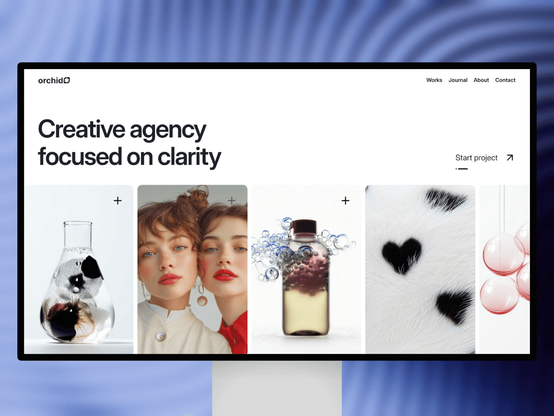
Texture works when it carries a purpose. It can reduce the “too perfect” feeling of digital surfaces, soften sharp compositions, and introduce a quiet sense of depth. In brand work, it often signals craft. In editorial layouts, it can add a physical, printed quality. In product pages, it can make minimal designs feel warmer and less sterile.
The problem is that texture is persuasive even when it’s wrong. Grain and noise can make almost anything look “designed,” which is why people overuse it. When texture is doing the heavy lifting, it usually means the hierarchy is not strong enough. Type, spacing, and composition should lead. Texture should arrive after those are already working.
A helpful way to think about it is contrast. If your texture competes with content contrast—especially body text—it will quietly damage readability and focus. The effect may feel subtle, but the result is real: users scan less, understand less, and bounce faster. The most common mistake is placing texture behind text without adjusting the typography to match the new visual environment.
Where texture actually helps
Texture tends to shine in controlled areas: backgrounds, large image blocks, or sections that exist to set tone rather than deliver dense information. It also works well when it is tied to a concept—something that relates to the brand’s world, materials, or cultural references. When texture has meaning, it stops being decoration and starts being language.
Keeping it disciplined
The cleanest approach is to choose one texture “character” and commit to it. Not five different noise types across the site. Not a different overlay per section. Consistency is what makes texture feel intentional. Also, texture should have a clear volume control. If you can notice it immediately, it’s probably too loud for most layouts.
If you’re using texture over imagery, treat it like a grading pass, not a mask. The image should still be the image. If you’re using it in the background, keep the hierarchy obvious. Your headings should remain crisp. Your body text should remain comfortable. Your CTAs should remain unmistakable.
Closing
Texture is most powerful when it’s almost invisible. It’s there to shape perception, not to demand attention. When your layout and typography are doing their job, texture becomes what it’s meant to be: atmosphere, depth, and a hint of humanity—without the mess.